

Nom Noms

You have a consumer goods and services app that needs a fresh design and competitive features.
Having a design researcher helps ensure the product is intuitive, modern, and engaging.
Want it delivered in a rush?
Goals: Identify how competitor fast food and fast casual apps design their apps and what features can we develop to compete with their offerings.
Client: [Sample]
Method: Personas, Competitive analysis, Contextual Inquiry, Task Analysis, Design Thinking, Wireframing
Duration: 4 weeks
Participants: []
Recruitment: []
Tools: Miro, Figma, MS Office
Background
The application intends to improve the experience of customers ordering food from a local slider burgers restaurant in a way similar and competitive to other food apps customers may use. The application is a sample application [the actual product redacted].
I conducted a competitive analysis and prototyping initiative to improve the design of the slider burgers restaurant.
The competitive analysis and prototyping initiative was conducted to answer these questions:
How are fast food and fast casual restaurants designing their applications and online ordering systems?
What are the preferences of users of these apps?
What unique features can we add our application to make our application more exciting and competitive?
Personas
Who’s hungry?
I looked into who are users of this local restaurant app to create personas and persona factors.
Personas are fictional sample users used to represent a real user.
Persona factors are variables about that influence users to behave differently than others.
Persona Development
There were three personas in the form of organizations:
A Student looking for quicky, tasty, filling grub that is inexpensive and premade as they have limited cooking options (and perhaps acumen).
A Parent looking to quickly and effectively feed their family as they navigate their daily schedules.
A Lunchtime worker looking for fast service that they can pre-order and return to the office or a quick bite to pick up after work to beat traffic.
Persona Factors
Some persona factors include:
Order and pick-up time effects a user such as a lunchtime worker’s willingness to use
Order complexity needs to be clean and intuitive such as for parents of large families that need to including many items and customizations
Pricing and discount displays can help users save money and incentive app use such as a student with limited funds looking to get the best for their buck
Technical acumen can influence if a user will complete an order and return to the application such as a grandparent having a hard time navigating the app to feed their grandchildren


Competitor analysis
Some menu options
I looked at how fast food and fast casual apps are displayed their offerings. I wanted to provide a variant between the three apps:
Pizza Hut: delivery focused pizza app, pizza being a commonly shared food offering with topping selections
Popeyes: pick-up and drive-thru focused fried chicken restaurant app with its meals offered individual as well as family platter sets and limited personalized setting but increased side dishes
Noodles & Company: pick-up and increasingly popular delivery (via external food delivery apps) noodles and pasta fast casual restaurant app with its primarily personal menu options and reasonable adjustments of toppings
I analyzed the apps by pages
Launch & Sign-In
Homepage
Offers (recommended & deals)
Rewards & earnings
Food selection (main items)
Food selection (customizing)
Food selection (ala carte items)
For each page, I observed heuristics
Intuitive flow of the page
Minimalism and aesthetic of the page
Error handling and responsiveness
I provided an overall rating for each page:
Green check = generally good
Yellow = minor heuristic issues
Red X = major heuristic issues


< Pizza Hut - Food Selection Pages >

< Pizza Hut - Home Screen >

< Pizza Hut - Offers & Rewards >

< Popeyes - Food Selection Pages >

< Popeyes - Home Screen >

< Popeyes - Offers & Rewards >

< Noodles & Company - Offers & Rewards >

< Noodles & Company - Food Selection Pages >

< Noodles & Company - Home Screen >
Context analysis
Narrowing down some desired items.

< Control >

< Monitor >

< Evaluate >

< Control >
Task analysis
How would ordering look?
I broke down how hungry customers would use fast-food apps. I created task analyses using the GOMS action-based task analysis. The user goals I examined were:
Add a new food to cart
Explore menu
Find a meal
Find and track rewards
View deals of the day
Select Rewards tracker
Edit and reorder a previous meal
Navigate to past order
Add item to cart
Edit order
Additional selection rules are displayed to distinguish and choose between methods noted in the top right corner in below task analysis images

< Edit/Reorder >

< Find/Track Rewards >

< Add Food >
Testing
Food inspection time (Heuristic evaluation)
Next, I led the evaluation of how well the fast-food apps handle the selected tasks. We served as UX experts independently used Nielsen guidelines to review the three competitor apps on the tasks:
Add a new food to cart
Find and track rewards
Edit and reorder a previous meal
The selected heuristics were:
Effectiveness: Does the app do what it is expected to do?
Efficiency: How long is the process to do what it is expected to do?
Learnability: How complicated is the process to do what it is expected to do?
Satisfaction: Is the app pleasing to use?
Forgiveness: What level of ability does the app allow for fixing errors and mistakes?
Each one of us scored the heuristic on the bases 1 (not fulfilled) to 10 (completely fulfilled).

< Overall heuristic score x Task x App >

< Average heuristic score x Heuristic >
Survey
Time for a taste test.
I surveyed potential users to see how they felt about the apps. We used convenience sampling to find 9 participants (students at a local university representing the Student persona. The survey asked students to
Identify if they have used the Noodle & Company, Pizza Hut, and/or Popeyes apps before
Use the app to add a meal, a side dish, and a beverage to the cart and check out to the point before paying
Determine the apps usability (System Usability Scale)
Rate the apps use and order time
Express their overall satisfaction and other thoughts of the three apps
Survey data was analyzed using descriptive statistics. A Welch Two Sample t-test was also used to account for the variance of usability between the experience group and the no experience group.
Satisfaction
Noodles & Company
100% of participants we able to learn how to use the app and complete the task
“I found it difficult to see all the options then choose and then move to other smaller items.”
“I found the error messages upon adding items to the cart annoying - each time I added something it said that it was under $15.00 - one error message upon trying to place the order that was under that amount would have sufficed.”
“The drink choices were fairly broad, but seem like that leaves a lot of room for errors I'm the customers drink order.”
“App was easy to navigate.”
“Easy, probably one of the most intuitive and easy apps to use for ordering food that I have used.”
“Easy to use”
Pizza Hut
100% of participants we able to learn how to use the app and complete the task
“I wanted to check out didn’t realize i needed to go to the cart to do that”
“I found the drink options for 20 oz and 2 L confusing - why not just small, medium, large”
“This app did not seem as colorful/picture heavy as other food ordering apps that I have used.”
“App was a bit slower to move to the next step after making a selection”
“Slow to load”
“This app was a little less intuitive than noodles and company. Some of the buttons seemed too small or I didn't necessarily know where to click sometimes. Loading was slower than I expected”
The food has arrived! (Results)
Experience using apps
Three participants that used at least one of the apps before
Six participants never used any of the apps
System Usability Scale
*Industry Average: 68 of 100
No experience group: Mean = 74.9 of 100
Experience group: Mean = 77.5 of 100
Welch Two Sample t-test: There is no significant difference in usability between experienced users and inexperienced users.
Use and order time
Noodles & Company: 78% of participants believed the time it took to complete all tasks on average was appropriate and expected
Pizza Hut: 56% of participants believed the time it took to complete all tasks on average was appropriate and expected
Popeyes: 44% of participants believed the time it took to complete all tasks on average was appropriate and expected
Popeyes
56% of participants we able to learn how to use the app and complete the task
“I am not familiar with popeyes food so I had to learn more and then learn a new navigation system. they are all different”
“it's annoying that you have to sign up for the awards system in order to place an order”
“Seems tedious to get back to the menu page if you wanted to add a second item.”
“App includes too many pop-ups”
“Couldn’t find a restaurant near the address after it said it couldn’t deliver to the address, and from there even the map wouldn’t load to find somewhere else. Sad!”
“could not get to check out without creating an account”
“Easy UI to use, not very attractive color wise or design wise though. It was kind of unpleasant to look at. Buttons were big which was nice and it was nice that I could add sides directly on the add a main dish page.”
“I was not able to get to checkout without making an account, which I did not do.”

< Popeyes - Learnability >

< Pizza Hut - Learnability >

< Noodles & Company - Learnability >

< Efficiency x App >

< Effectiveness x App >

< Effectiveness x Experience group >
Prototyping
Making ordering look good. (Design thinking)
We took sometime to think about how our app could look.
Round 1:
After discussing and bouncing ideas off each other, we decided to further ideate and refine:
More ways to be rewarded
More ways to earn points


Round 2:
From our second round of brainstorming, we chose several ideas to incorporate into our app, including:
Visual tracking of points progress
Challenges with people in the area
“Coupons” for earning bonus points
Rewards bazaar for browsing rewards
Incorporation of rewards besides just food


Dressing the meal up. (Mockup)
We wanted create an example of how the app would actually look. We designed with influence from features with strong usability and user satisfaction from the competitor apps. We incorporated ideas developed through design thinking particularly on app layout and the rewards/coupons system.
To develop the mockup, the following tools were used:
Adobe XD
Adobe Photoshop
Stock icons and photography
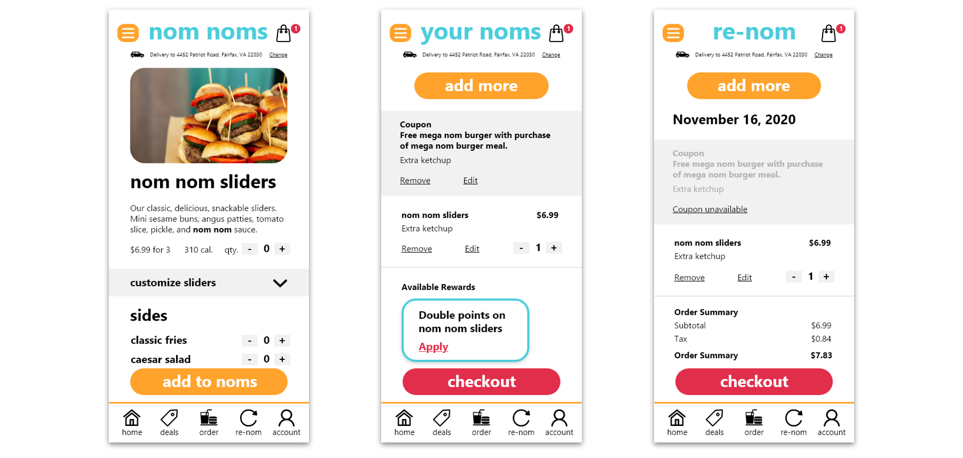
The prototype includes:
Starting Navigation
Quick points overview.
Quick links to features offered by app (Order, deals, events, etc.)
Menu organized by category with quick navigation to other categories.
Adding Food and Checking Out
Reduce lengthy scrolling to add food to bag.
More opportunities to edit orders.
Rewards, Redemptions, and Coupons
Opportunities to earn more points.
More interactivity besides passively gathering points.
Points can be redeemed for merch or prizes from partners (such as game content.)
Rewards and points separated from coupons and housed under “account.”

< Rewards, Redemption, & Coupons >

< Adding Food & Checking Out >
< Starting Navigation >
Delivery
An awesome food service app. (Conclusion)
We came up with a few ways to make fast-food apps ore user-friendly.

Note. This was a project was developed as independent research and not intended to be implemented. However if implementation were intended, user testing and evaluation on the overall usability of prototype would be necessary. There can also be further refinement on the new rewards/coupon design.